
05.03.2018 ~ 23.03.2018
– Typographic Overview
- This project aims to explore text in many forms: graphic and pictorial, structural, and interpretative. Students are encouraged to not only consider text graphically and pictorially, but also engage with the manipulation of the structure and meaning of text.
- We will look at text as a malleable encoded form, demonstrate how to assemble and disassemble it, use it as a data form, and more. Areas of particular interest are formal rule systems for type layout and letterforms.
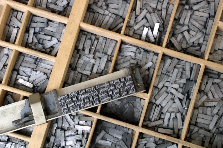
- Students will also visit the Reid Building case room to witness the physicality, history and methodology of letterpress printing.
Design Domain project finalize delayed a week, because of heavy snow. And someone need a tutor’s help. So, after launched Typography project, we did two projects at the same time.
Before I started my project I searched what is typography? ‘Typography’ is the art and technique of arranging type to make written language legible, readable, and appealingwhen displayed. The arrangement of type involves selecting typefaces, point sizes, line lengths, line-spacing (leading), and letter-spacing (tracking), and adjusting the space between pairs of letters (kerning).
The term typography is also applied to the style, arrangement, and appearance of the letters, numbers, and symbols created by the process. Type design is a closely related craft, sometimes considered part of typography; most typographers do not design typefaces, and some type designers do not consider themselves typographers. Typography also may be used as a decorative device, unrelated to communication of information.
Typography is the work of typesetters (also known as compositors), typographers, graphic designers, art directors, manga artists, comic book artists, graffiti artists, and, now, anyone who arranges words, letters, numbers, and symbols for publication, display, or distribution, from clerical workers and newsletter writers to anyone self-publishing materials. Until the Digital Age, typography was a specialized occupation. Digitization opened up typography to new generations of previously unrelated designers and lay users.
As the capability to create typography has become ubiquitous, the application of principles and best practices developed over generations of skilled workers and professionals has diminished. So at a time when scientific techniques can support the proven traditions (e.g., greater legibility with the use of serifs, upper and lower case, contrast, etc.) through understanding the limitations of human vision, typography as often encountered may fail to achieve its principal objective: effective communication.
In this project we need to focus on explore text in many forms: graphic and pictorial, structural, and interpretative. Students are encouraged to not only consider text graphically and pictorially, but also engage with the manipulation of the structure and meaning of text.
We will look at text as a malleable encoded form, demonstrate how to assemble and disassemble it, use it as a data form, and more. Areas of particular interest are formal rule systems for type layout and letter forms.
And we need to choose what kind of programme are we going to go use. We have two options Processing and After Effect. In my case, I decided to work with After Effects.
Next, I thought about the subject. However, honestly in the first week I cannot 100 percent concentrate on this project (because of Design Domain exhibition). So, during the first week, I learn about how to use After Effect through out Youtube.
2nd weeks
Second week we visited Case Room where is mainly a place to do typography, letterpress printing, and book production. In the case room, we listen to what is typography and whole history. All of explanation was very informative and also he showed us a lot of sample works. Through out sample works, I understand there a such a lot of way can express for typography. 
On Friday, we have interim review. However, I did not think about idea at all for this project, so, I just showed that I did that following a typography tutorial on the Youtube and Adobe. And I showed oriental painting style typography too. I will decided to final idea for the weekend.


3rd weeks
On Monday, I had personal tutorial. At that time, I am still do not have idea about what I will do. I said for my situation and need to help. And tutor suggest that if you like to work with animation, I recommend you to watch this artist group work. He opened one of Japanese artist website. And he showed me a work that write down a number using by pencil, after they are gathering all of number and and making it look like a real clock.
Personally agreed 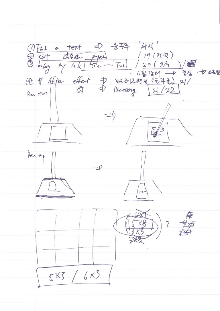 that the installation work of writing a handwritten number on this site was very interesting, so I agreed with the tutor that this would work. In a similar way, I decided to create typography using handwriting. And I asked can I use Korean poem in the project and he said you can. So, I will use to ‘Han Shi’ that written by Kim So-Wol.
In this project I decided to utilize oriental painting materials from Korea. When I went through the above tutorial, I asked if I could use a Korean poem. So I thought to work with Kim Soo Wol ‘s’ Hanshi’.
Who is Kim Sowol (김소월, September 7, 1902 – December 24, 1934) was a Korean poet. He is most famous for his contributions to early modern Korean poetry. Throughout his life he wrote his beautifully poignant poetry in a style reminiscent of traditional Korean folk songs and consequently became known as a ‘Folk Song Poet’. The most prized example of this style was “Azaleas (진달래꽃)”, the title poem of his sole collection of poetry.
Working Process
First, I cut the paper with one size of letter and then filming the scene of writing letter. I will adopt the method of reconstructing the images using by After Effects.


However, I am really worry about using this materials. Because, I not touch with oriental painting since when I start to study in the UK. Moreover, I am not sure about can I write down skilled hand calligraphy. Because, I do not learn about Korean calligraphy before, I just did Korean painting more than 5 year (painting and calligraphy is quiet different).
Finally, calligraphy quality is not that much good than I expected but… successfully finish my presentation and work and it was really good experience to me.
Thank you for reading my blog 🙂
The Glasgow school of Art
Interaction Design Year 2
YongWon Choi
