
‘Graphic Narratives’ is a five-week long-term project. The direction of the project was to create infographics using After Effects. An infographic is a visual representation of information, data, and knowledge. It is used to express information quickly and easily. It is used for signs, maps, technical documents, etc., and as a tool to visualise conceptual scientific information such as computer science and statistics.
In this project, we have to make a 2-minute video with personal interests. For example, if you’re interested in ‘A’, you need to create a two-minute video that conveys information about ‘A’. The length of the video is limited to 2 minutes is the interest or concentration of viewers watching the video decreases after 2 minutes.
On the day of the project, a general overview was given. We learned how infographics have evolved from the 1920 poster form to today. And tutor said we need to read short journals on the history of infographics and after effects, organize your thoughts, and discuss next week.
Graphic Narratives Overview
Infographics are not new they have been around as far back as the 1920s; London’s Transport Museum is testament to this. Infographics are visual representations of information, data, or knowledge meant to present complex information quickly and clearly and use many different strategies to present information, including graphs, charts, maps, diagrams, and pictures (and often a mixture of these).
Animated Infographics have taken this a step further and are one of the most effective ways of communicating information, increasing viewer engagement, understanding and enjoyment. They can educate, inform, entertain, and most importantly, are far more memorable than pages of text or numbers.
Your brief is to create an imaginative piece of animated infographics, 2min in length about a topic of your choice – with a strong focus on storytelling and creativity – that presents complex information quickly and clearly.
On Friday there was a workshop on how to use After Effects. Since this is my first time working with after effects as the main, I’ve been slowly approaching from the beginning. Basically, tutors explained composition creation, frame setting and key frame. I learned how to use text, how to use effects, and the Cinema 4D Library.
During the weekend, I read journals that are essential reading for the next week’s discussion called ‘After Effects, or Velvet Revolution’. The core of the journals were the changes in the personal studio, film industry, and design industry that resulted from the introduction of personal computers and after effects in the 1990s.
The emergence of After Effects has brought together equipment that had previously been costing thousands of dollars into a single piece of software. And their emergence has created a huge laboratory where various media can meet and combine since the late 1990s, creating a new species that combines aesthetics and technology. While this simplification of digital compositing was initially unrecognized and only concerned with film and video editing, today’s hybrid languages (media interactions in ways previously unimaginable) dominate our visual culture. It was a story.
Other readings describe the design of infographics and a new form of aesthetics, Rev Manovich’s Aesthetics of New Media. However, this text was difficult to fully understand completely because of many difficult words, but I understand contexts are divided into system design and user-oriented design. As a result, all designs are used to invent something that does not yet exist. In design, usefulness, health and attractiveness must be balanced. Well-balanced design raises long-term memory and is associated with the aesthetics of new media.
Data visualisation covers a wide range of applications and can be broadly classified into two categories: computer science and artistic expression. In the field of computer science, solving requirements is aesthetic and takes precedence over the user experience. However, software development techniques and increased public access to data sources affect data visualisation.
On the other hand, data visualisation as a means of artistic expression is a popular approach, aimed at helping people to understand complex social issues easily through artistic visualisation. And because popular culture influences the study of data visualisation, it requires multiple processes rather than emotional and personal processes. This difference in approaches leads to a crack between the stakeholders involved. In this essay said that we have to learn from each other and that it is now essential to the designer’s participation on the visualisation of the design.


After reading the material, still I wasn’t sure what to do with it, so I researched the infographic further.
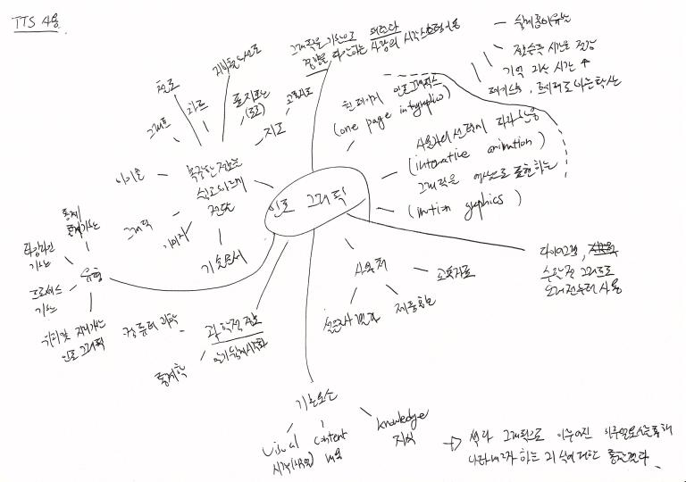
Infographic is,
– Easily and quickly deliver complex information (technical documents, traffic maps, signs, charts, charts, etc.) using images, graphics, icons and graphs.
– Types of infographic are statistical, timeline based, and process based.
– Basic elements are Visual, Content, Knowledge.
– Uses can be used as survey results, products, and education materials.
– and has long been used in mathematical graphs such as diagrams.
– It is important for users to experience visualisation so that they can easily understand the data and focus on acquiring information or to search for information that is used to increase the participation of the audiences.
– Infographic using data for personal expression or display of work.
– It uses the visual system of a person who grasps patterns and trends based on graphics. The reason is that it is easy to generate interest, to reduce information acquisition time, to increase the time of memory persistence, and to spread quickly using media.
– Types of infographics include One Page Infographics, which represents one page, Interaction Animation, which responds to user’s choice, and Motion Graphics, which represents graphic images.
This is the result of insight into the knowledge to be expressed through visual elements made of color and graphics.
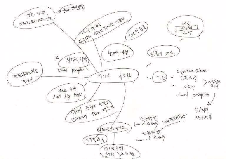
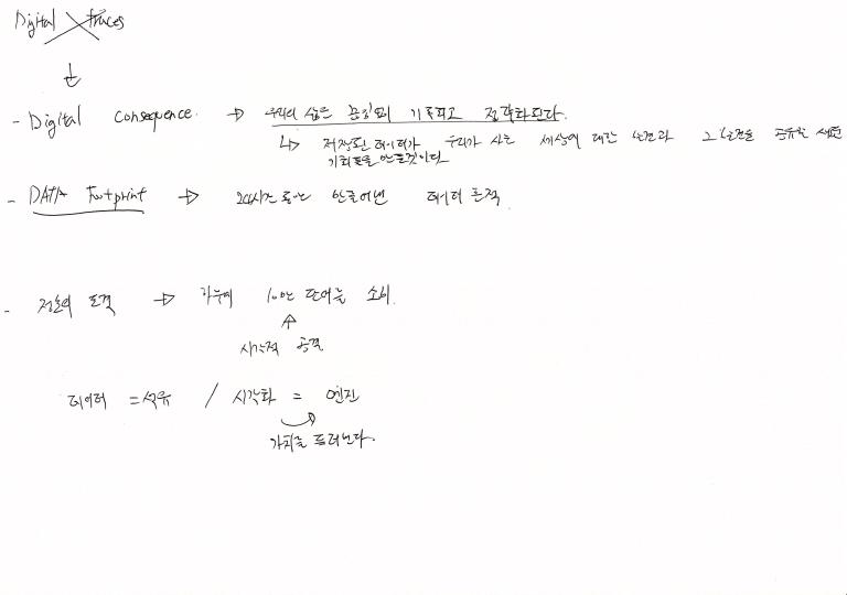
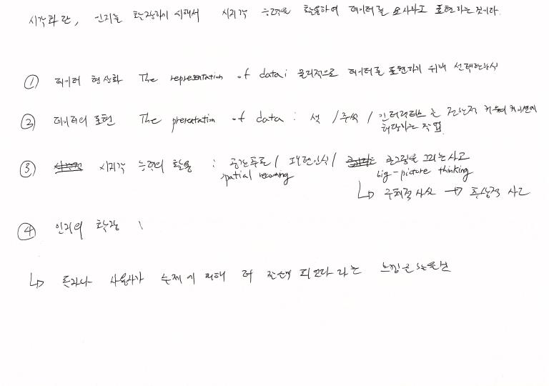
In the case of infographics, data visualisation is important. Visualisation refers to the use of visual abilities to describe and express data to expand perception. Including Data shaping, data representation, utilization of visual perception capabilities, and cognitive enhancement.
Things to consider when working with visualisations
– Who is the audience, And the scope of the project to meet any requirements. Process clarification.
– Function should be considered.
– Is it for explanation purposes? – whether it is a description for others, informational or specific, intensive content.
– For exploring? – It focuses on understanding the data and getting information while users are experiencing visualisation. Consider audiences participation.
– Is it intended for expression? – Personal expression using data or exhibition of works using data (data art).
– It should not be a stage to show off technical competence.
– Data visualisation is a process of discovery and amplification of cognition.
– It is a process of conclusion, not a conclusion itself.
– We should take advantage of visual ability and avoid weakness of cognitive function.
– Do not deceive users by emphasizing only visual distortions and decorative purposes and styles.
– It is in the middle of art and science.
– Based on cognitive science and visual perception (visual information processing), eye-brain interaction.
– Gestalt’s Law (Low of Similarity and Low of Proximity) applies. Means the method of perceiving the form or its rule.
Which is better to emphasize, artistic or scientific? Scientific aspects preserve the accuracy and efficiency of the results, and the artistic side is a new aesthetic link with empirical aspects and creative expression of the data.


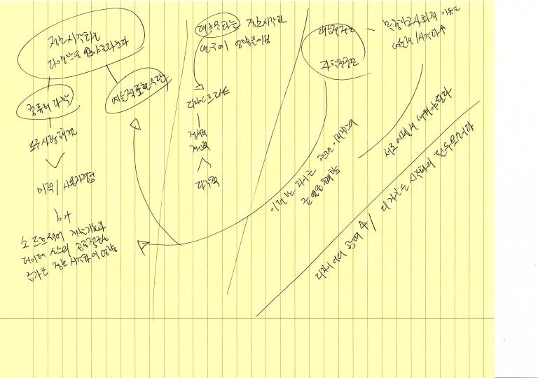
After arranging the above materials, I still thought about various subjects. In conclusion, I decided to work towards visualising Korea’s cultural heritage. The number of foreign tourists visiting Korea has increased considerably compared to the past, and while Korea has a significant influence on the world, socially, culturally and economically in 21 centuries, but not known much about relics and history. Because Korea under Japanese rule from 1910 to 1945 and Japanese imperialists instituted a policy to obliterate Korean culture. Moreover, we had a Korean war between 1950 and 1953 then Korea was a one of poorest country in the world.

At first, I start to analyze the work of famous Korean painting artists and using the painting elements I will create the individual assets of nature, people, and buildings. Then using 3D layering, I wanted to work on objects move separately and tell stories linked with painting. However, it was not easy to make assets for Korean painting feeling using computer.
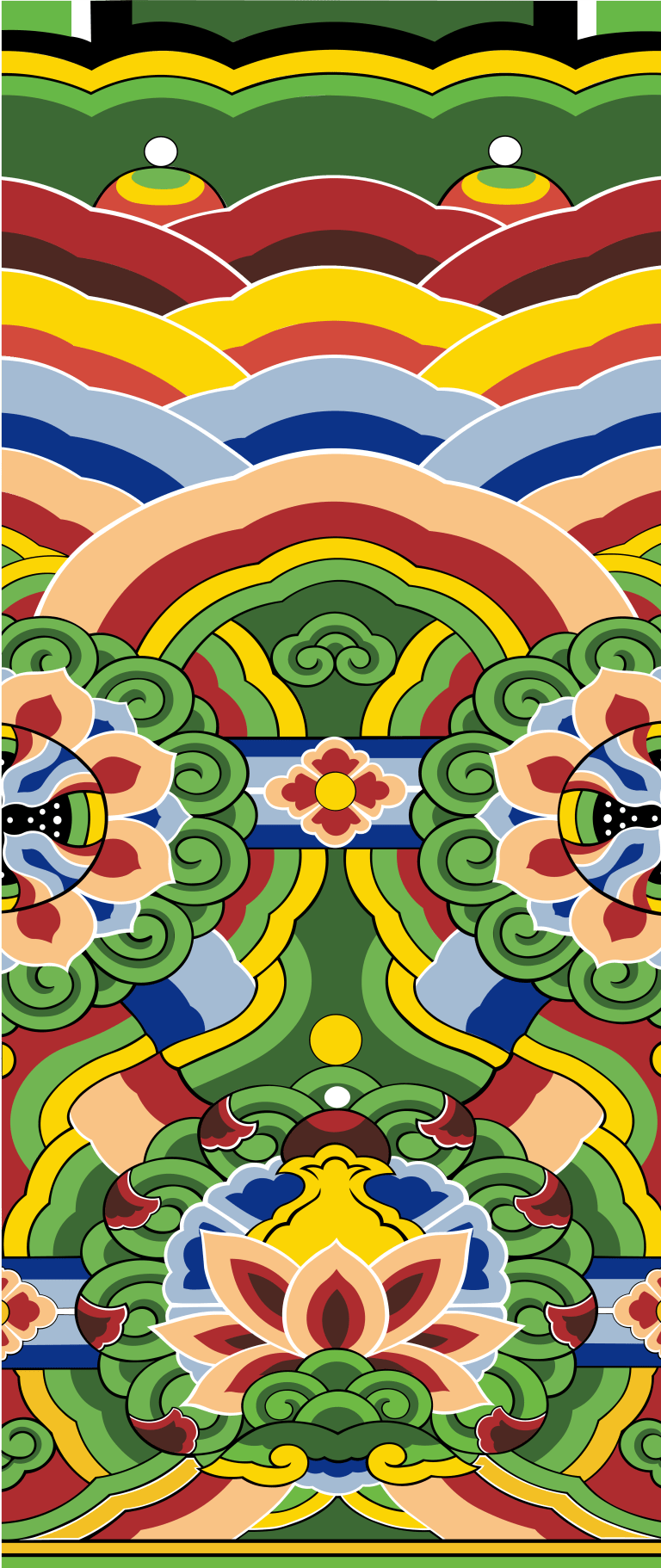
Since then, he has come up with ideas in other fields. The result was a building, which was ‘Dancheong’. There is no shortage when looking at visual splendor, and it is a relic that has historical value when looking at the purpose of information transmission. And the meaning of different patterns, the combination of colors used, the reason for drawing ‘Dancheong’, the story behind the purpose, and so on. It was because it possible to make various stories inside relate with this project.
For the purpose of delivering information, I thought ‘Dancheong’ would be a field that people in the Western world are not familiar with. In addition, when I researched on them, there was no case of motion graphics predecessor using ‘Dancheong’. So, I decided that this topic was appropriate. ‘Dancheong 단청(korean) = 彩畫(chinese)’ exists in all three far east Asian countries, but in different forms. I also considered making a comparative video on this, but decided to deal only with Dancheong in Korea because it was not easy to find data on Japanese Dancheong. And historically in the Japan this style is not be a popular like as Korea and China. Because Japan is island, they were hard to accept new culture from mainland.

After deciding on the subject of this work, I gathered data on Dancheong. About Photographs and Journals about Korea Dancheong.
As I gathered the materials, there was another workshop. This workshop covered a bit more than the first week’s workshop. For example, how to use Cinema 4D in After Effects and how to use plug-ins.
The day after the workshop, an interim review was planned, in there I introduced what is a ‘Dancheong’.
DanCheong is a drawing of various patterns and drawings on a wooden building using five colors of blue, red, yellow, white, and black as a base. Originally, the primary purpose was to make the buildings that are stand out. The brilliant color raised the authority of the building. Therefore, it was widely used in public and prestigious buildings such as palaces, temples, and scholarship.
The practical side is to hide the worms on the trees and prevent rotting, and to hide the cracks of the pine trees commonly used as building materials in Korea and to cover the defects of architecture. The pigments, which are the raw materials of the DanCheong, originally used mineral (inorganic salts) coloring as either dark color or dark color. Also, monochrome is matte, so even if it is backlighted, it emits its color.
Just as there is a thought in architecture, it was created and developed based on the thought of Dancheong. The thought of Dancheong is based on contrasting ideas and one of them is Yin-Yang and Five-Elements. The Five-Elements have symbols, each element has different symbols.
Wood(木): Spring(春) ― East(東方) ― Blue(靑色)
Fire(火): Summer(夏) ― South(南方) ― Red(赤色)
Earth(土): (土用) ― Centre(中央) ― Yellow(黃色)
Metal(金): Autumn(秋) ― West(西方) ― White(白色)
Water(水): Winter(冬) ― North(北方) ― Black(黑色)
Blue, red, yellow, white and black are the basic colors of DanCheong. When this basic color is toned according to the yin and yang, an intermediate color appears. That coloring the five colors and neutral colors according to the yin and yang would be the color of DanCheong. In this color, ancestor thought that the meaning of the universe is expressed.


The tutor’s and friends’ reactions were not bad, and I decided to continue working.
Interim Presentation Concept Dancheong
– Korean art of painting buildings – main functions of painting are to protect building, but much more than that is the visual aesthetic. The unique and colourful designs on traditional Korean houses which are full of meaning and there to protect buildings from evil spirits. Decorative designs derived from 5 elements plus positive and negative. Interested to know the illustration style you intend to use for the images that fill letters. Are you going to use assets or create vector graphics? This has the potential to be very beautiful and poetic but consideration should be given to the balance between an experiential piece of motion graphics and one that informs. Consider what type of music you intend to use and how it ties in with the visual.
Research
Excellent research, and interesting to hear of your previous experience in creating these stencils.
Planning
You should create a Gantt chart that shows your project plan and milestones – a good practical tool for tackling the planning and development stage of your projects.
Presentation
This was clear and informative and provided us all with an insight into your background and the context for the project.
After the end of the tutorial, I made a more detailed project plan, gathered more information on Dancheong, and started drawing Dancheong patterns from the weekend. In addition to the work of drawing Dancheong patterns, at the same time overall composition of the result was also considered.


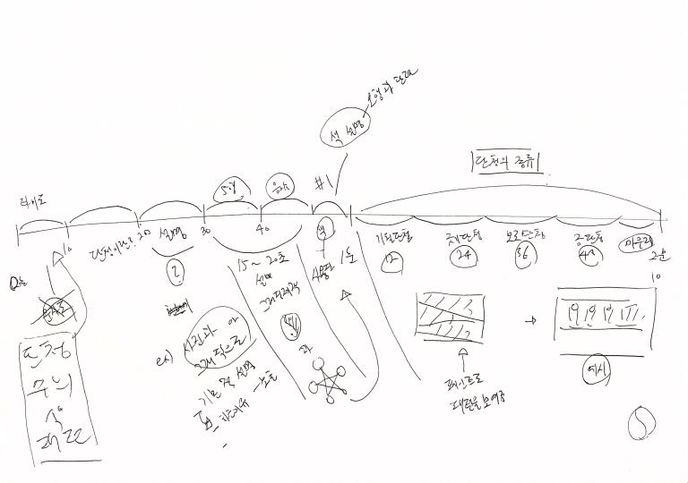
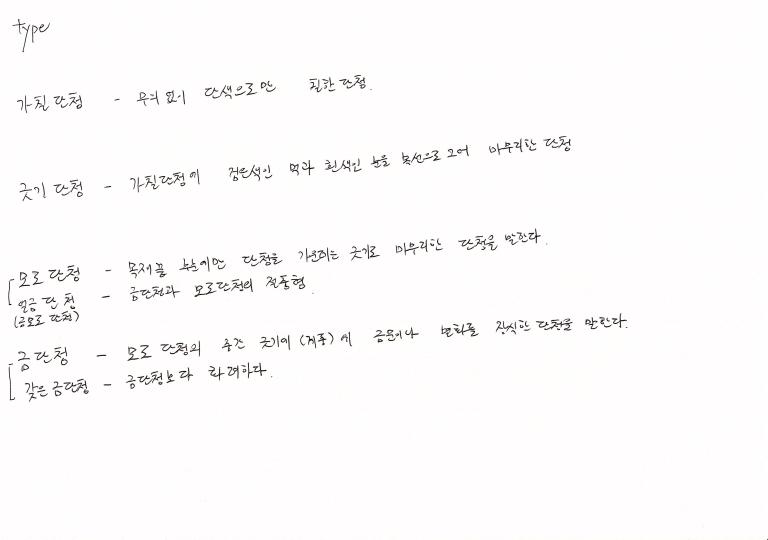
The first half of the video will consist of the introduction of Dancheong, and the second half of the video content will consist of four patterns (Gachile, Geut-gi, Molo, and Guem DanCheong) classified according to the hierarchy of the Dancheong.
I required a file that would not break even at higher resolutions. I worked with Illustrator that can get a vector image.


While drawing on the Dancheong pattern, there was an additional tutorial. It was a tutorial that talked about the current progress of the project and the future plans if that were further modified. In this tutorial, I showed Dancheong patterns I drew to tutors and then we talked about how video will be consist.


After the tutorial, I spent 10 hours a day to finish drawing the pattern. Then I started drawing the video background. First, I painted the title background, and the pattern of eaves, yin and yang and five elements, which will be added as a visual element. The background painted the building inside Gwang-hwa-mun and Gyeong-bok-gung Palace.


After working on the background, I started to make a video. The opening title I tried to give the impression that it was written in Asian painting, and Gwang-hwa-mun was placed at the bottom. The title was set to ‘Icon of Korea.’
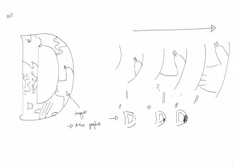
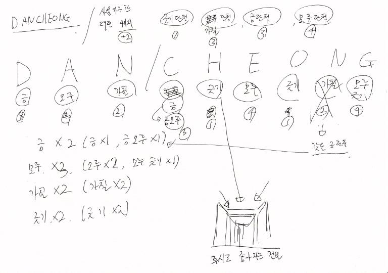
After the title, the Korean and English notation of the Dancheong appears. Originally, the Dancheong letters were intended to proceed in the form of a ‘문자도’. But I replaced letters to simple images, cause of consideration about deadline. Then Yin-Yang and five elements shown, which is the principle of color mixing, are arranged.


After explaining the Yin-Yang and Five Elements, the function of Dancheong was explained. In describing the tree’s protection against extreme temperature changes, the four seasons were presented to add visual elements.


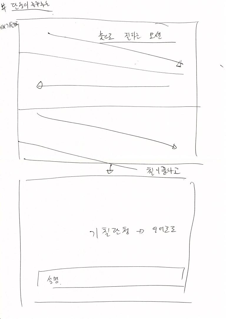
In the latter part of the video, four different shapes of Dancheong animation were included, that viewers could easily understand the patterns and names of the Dancheong.


Finishing the layout of the approximate scenes, and I struggled with arranging the time per scene. The scene felt fast or boring even a few frames apart.
In particular, the most troublesome part of the layout was the text. It’s because just a difference of 1 second, viewer cannot read a text or feel too long of them. Nevertheless, given the distribution of language usage around the world, I chose to pass slowly because fewer people could read English faster than others.

Still feeling a bit lacking somewhere, but the day of the presentation is approaching. From this announcement, tutors chose a different way from the previous presentation. Giving feedback one by one makes the presentation too long, so tutors created a shared document file and wrote it there. Personally, I think it was a pretty good idea. Usually, when I get feedback, I end up with a few things to forget and something cannot note.
In the feedbacks of the friends for my work, I got good feedback about working with illustrator of the four seasons. I think most of the drawings or manual works got good feedback. Everybody liked the choice of music, and some of them gave feedback that they learned something they didn’t know.
However, as I was concerned about, the text composition was not very well feedback. Some commented that the speed at which text was passing was slow. And there was feedback on the font of the text. Many pointed out that the font was comic or awkward in the whole flow. I’ll have to find out more if I can substitute another font. And there was an opinion that voice over would be good, but I didn’t put it because it would be more distracting if the voice came in. Probably not going to add voiceover to future work.
Modifications before the final submission are likely to be, the first to adjust the timing of the text and the second to the overall transition. This was my first time working with Motion Graphics with After Effects, but it was a lot of fun. In fact, if you can deal with after effects professionally, you can benefit greatly from editing and introducing your personal work. Therefore, I will be familiar with additional useful functions before the end of 3rd year.
This is result of this project.
Thank you! 🙂
